
This box of illustrated cards showing common traffic signs has been kicking around my house for about 20 years. I think I got it at a garage sale or maybe an antique shop when Daughter Number Three-Point-One was little. (When she was a teenager, she had several of the cards pinned to her walls.) It appears to have come from a religious school of some kind, given then Messiah name written on the front; the teacher's guide is still in the box.
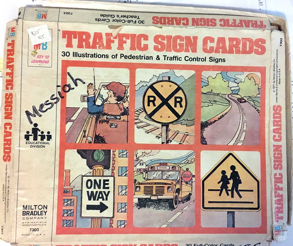
The box itself is in not great shape, as you can see, but the cards were protected and are in perfect condition. They are a nice example of a particular kind of commercial illustration style that was popular in the 1970s. I don't think it has a name, but I'm sure anyone who lived through the ’70s recognizes it:

The organic lines, the color washes...


...and particularly the way the lines are inked:

(Nope, we wouldn't want any bike riders to use this inviting road through beautiful countryside. Nosirree.)


One aspect of the line inking is particularly noticeable in this drawing of a groovy guy making a left turn signal:

Yes, I mean that grass-like cross-hatching used for shadows and texture. Combined with his hair and that rosy-cheeked smile, he looks like something right out of Schoolhouse Rock.
One other thing these signs make me think about: how little our road signs have changed since 1977:


There are plenty of others in the box but they're like these last few: almost too literally the same as the signs we see every day. The illustrations don't have as much detail or character; they could almost be found on any street corner.
Friday, July 7, 2017
Milton Bradley Traffic Sign Cards, 1977
![]()
![]()
Subscribe to:
Post Comments (Atom)

No comments:
Post a Comment